2. Layered visualizations with ggplot2
Here we introduce the main features of the ggplot2 R package, but we refer to “The Layered Grammar of Graphics” and to the relevant chapter of “R for Data Science” for more details.
Intro to ggplot2
Let us start by considering a very simple example:
library(MASS)
data(mcycle)
head(mcycle)
## times accel
## 1 2.4 0.0
## 2 2.6 -1.3
## 3 3.2 -2.7
## 4 3.6 0.0
## 5 4.0 -2.7
## 6 6.2 -2.7The data set contains only two variables: acceleration and the time at which it was measured during a simulated motorcycle accident (see ?mcycle for more info). This is a classic example where we would like to visualize the data using a scatterplot, which can done quite easily using base R plotting methods (more precisely, plot.default from the graphics package):
plot(x = mcycle$times, y = mcycle$accel)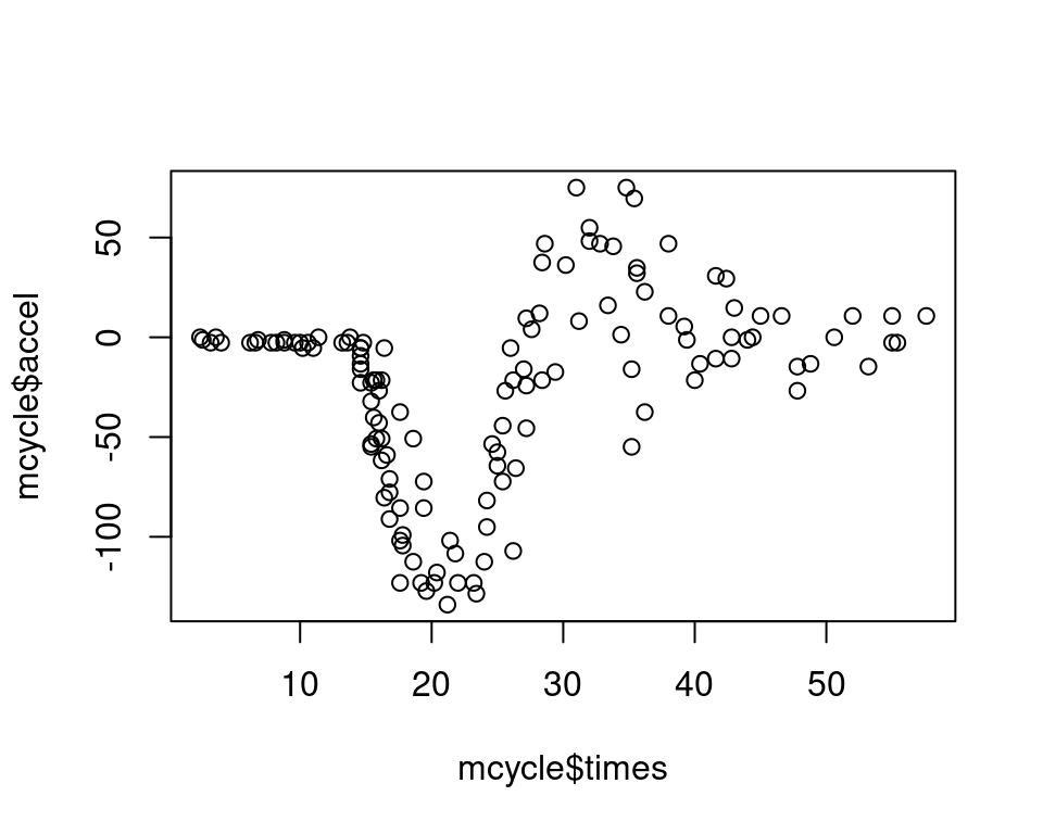 Base R plots are generally called for their side effects, rather than for their returned value. For example, the
 R code executed within plot.default renders the scatterplot shown above, but this function does not return anything useful:
tmp <- plot(x = mcycle$times, y = mcycle$accel)tmp## NULLTo obtain a similar plot with ggplot2 we first create a ggplot object:
library(ggplot2)
pl <- ggplot(data = mcycle)
class(pl)
## [1] "gg" "ggplot"As you can see, nothing has been plotted so far, the plot is rendered upon evaluation on the console:
pl but the plot is empty, so there nothing to see! This is because we haven’t added any graphical layer to the plot. To get a scatterplot we must add the
 geom_point layer from ggplot2 as follows:
pl <- pl + geom_point(mapping = aes(x = times, y = accel)) We’ll explain how the mapping argument works in minute. To render the plot, we do:
pl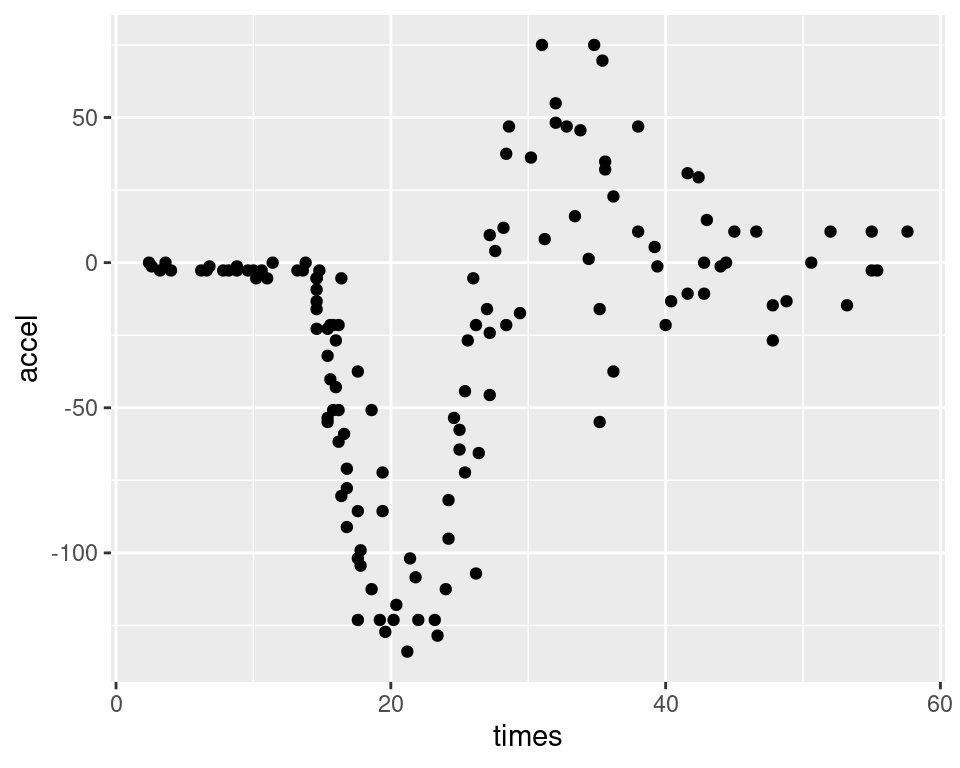 Remember that evaluating an object,
 pl in this case, on the R console triggers a call to the generic print function. Given that pl has class ggplot, this dispatches to the print.ggplot method (not exported by ggplot2, but you can see its code by doing ggplot2:::print.ggplot). Of course, we can do the whole thing in one step and get the same result (not shown):
ggplot(data = mcycle) + geom_point(mapping = aes(x = times, y = accel))The code above shows that the first difference between ggplot2 and graphics plotting methods is that ggplot2 explicitly separates the plot-building phase (initial plot creation using ggplot, followed by addition of layers such as geom_point) from the rendering phase (performed by print). ggplot2 also distinguishes the data.frame that contains the variables to be used in the plot (mcycle in this example, which is passed to the initial ggplot function) from the variables names that are specified when calling the specific layers (accel and times, which are passed to geom_point). A generic ggplot2 template might look something like this:
ggplot(data = <data.frame>) +
  <geom_layer>(mapping = aes(<variables_map>))
where:
ggplotcreates the initialggplotobject, containing no graphical layers. The main argument here is adata.frame.+is an overloaded operator which will dispatch to+.gg(see?"+.gg") when its l.h.s. is an object of classgg. The r.h.s. can be a graphical layer (denoted by thegeom_prefix inggplot2) or another function that modifies the plot (e.g. see?theme). The result of the call to+.ggis that the plot on the l.h.s. is modified using the r.h.s. and returned.geom_layeris a graphical layer, such asgeom_pointin the example above. Each layer needs a mapping, for examplegeom_pointneeds to know which variables (among those contained in the initialdata.frame) must be plotted on the \(x\) and \(y\) axis. This is specified using theaesfunction.
To illustrate some slightly more advanced features of ggplot2, we consider the following data set on electricity demand:
library(qgam)
data(UKload)
head(UKload)
## NetDemand wM wM_s95 Posan Dow Trend NetDemand.48
## 25 38353 6.046364 5.558800 0.001369941 samedi 1293879600 38353
## 73 41192 2.803969 3.230582 0.004109824 dimanche 1293966000 38353
## 121 43442 2.097259 1.858198 0.006849706 lundi 1294052400 41192
## 169 50736 3.444187 2.310408 0.009589588 mardi 1294138800 43442
## 217 50438 5.958674 4.724961 0.012329471 mercredi 1294225200 50736
## 265 50064 4.124248 4.589470 0.015069353 jeudi 1294311600 50438
## Holy Year Date
## 25 1 2011 2011-01-01 12:00:00
## 73 0 2011 2011-01-02 12:00:00
## 121 0 2011 2011-01-03 12:00:00
## 169 0 2011 2011-01-04 12:00:00
## 217 0 2011 2011-01-05 12:00:00
## 265 0 2011 2011-01-06 12:00:00See ?UKload for details. We start by plotting electrity demand vs temperature (wM), but we colour the data depending on whether it belongs to a “winter” period (Oct to Mar) or a “summer” (Apr to Sept) period:
library(magrittr)
UKload$Period <- UKload %$% factor(Posan < 0.25 | Posan > 0.75,
labels = c("Summer", "Winter"))
UKload %>% ggplot(mapping = aes(x = wM, y = NetDemand, col = Period)) +
geom_point(alpha = 0.6) +
theme_bw()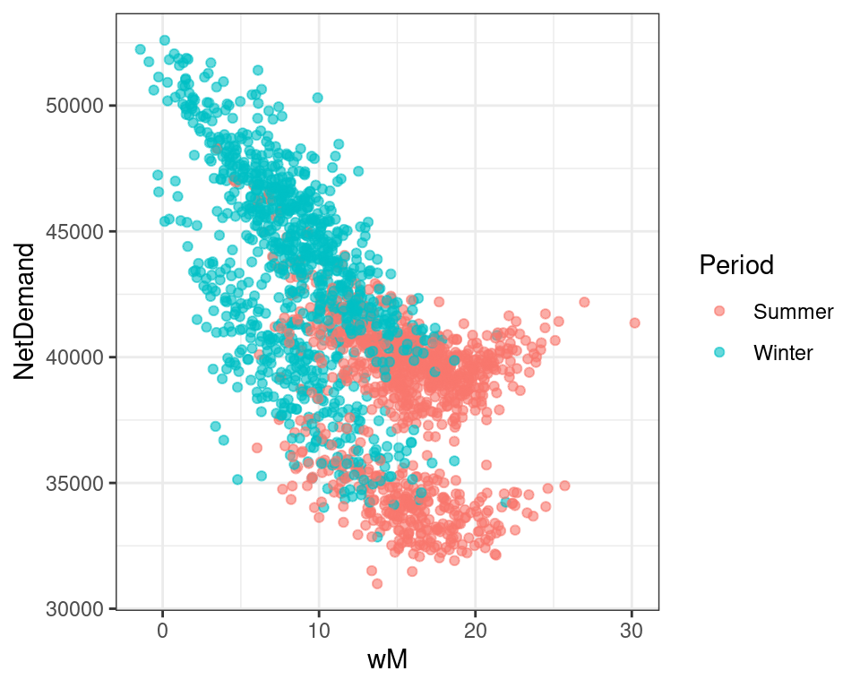 In the first line we loaded the
 magrittr package, because we want to illustrate that ggplot2 is compatible with pipes, while the second line creates the Period factor variable. Notice that the mapping now contains also the col argument. Argument alpha is used to make the points semi-transparent, which is useful because there is quite a lot of overlap between the points here. theme_bm() is not a layer, but a function that modifies the graphical appearance of the whole plot. The code above illustrates that the main workflow is based on getting the main data.frame ready beforehand and passing it to the ggplot function. Notice that the mapping between the variables in the data.frame and some of the characteristics of the plot (here the x and y axis, and the colour col) can be specified either in the initial call to ggplot, or in the specific layers (as in a previous example).
The last plot shows that, unsurprisingly, temperatures are lower in the summer than in the winter period (as defined above) and that at low temperatures the demand decreases almost linearly with temperature, while in the warmer perior the relation between demand and temperature is more complex. We also see that, in both periods, there are two vertically shifted modes of the joint distribution of demand and temperature. Investigating the origin of these modes gives us an opportunity to illustrate the faceting facilites offered by ggplot2. In particular, consider the following code:
UKload$DayType <- UKload %$% factor(as.logical(Dow %in% c("dimanche", "samedi")) |
as.numeric(as.character(Holy)),
labels = c("Workday", "Holiday"))
UKload %>% ggplot(mapping = aes(x = wM, y = NetDemand, col = Period)) +
geom_point(alpha = 0.6) +
theme_bw() +
facet_wrap(~ DayType)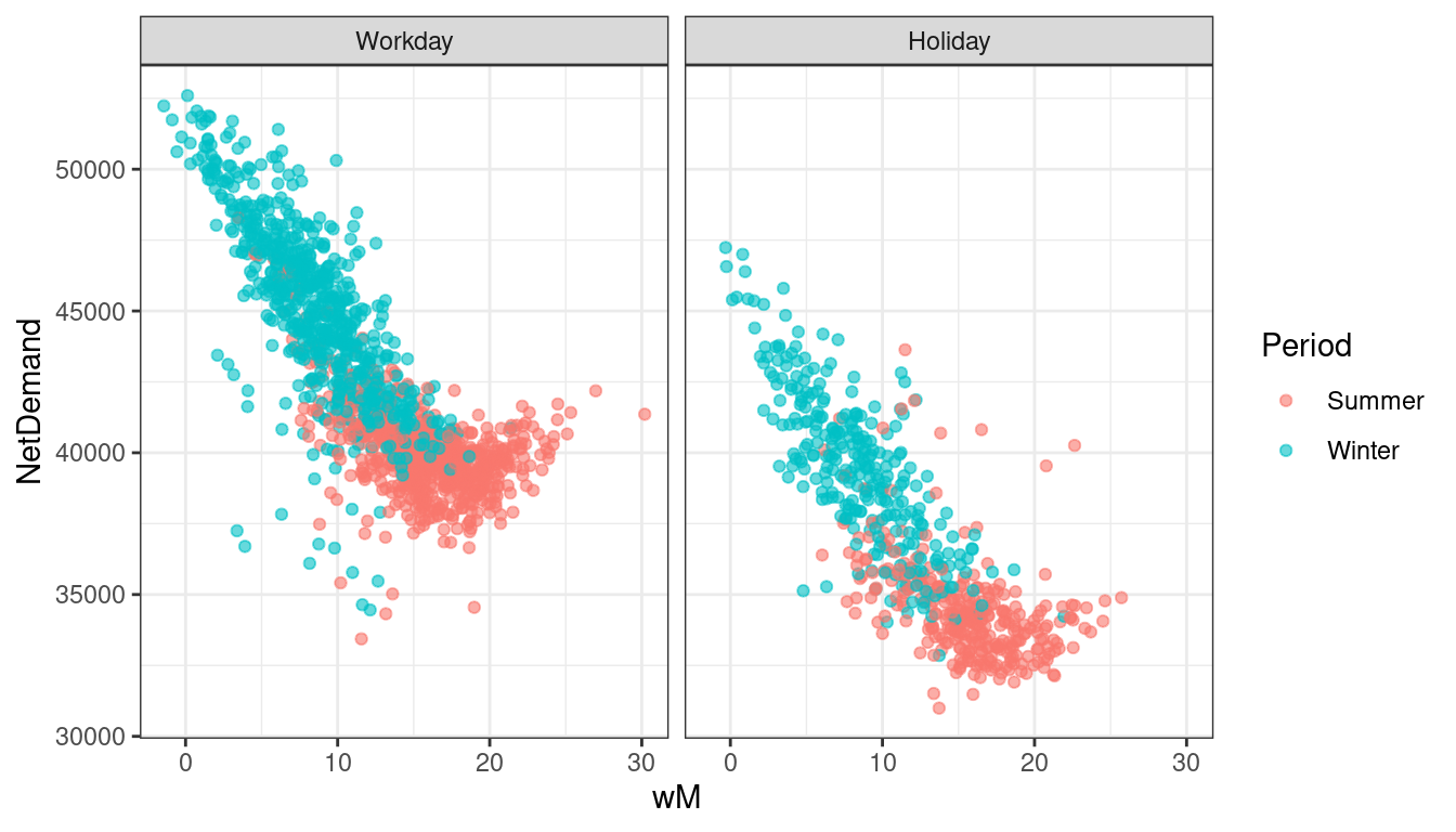 In the first three lines of code we are simply creating a new factor variable (
Daytype) which takes value "Holiday" on weekends and holidays (e.g. Christmas day) and "Workday" on the remaining days. Then we are creating the same ggplot as before, with the difference that we are adding facet_wrap to create a sequence of plots which depends on the value of Daytype. The faceted plot show that the two modes we identified before roughly correspond to the working days and holidays/weekends, the demand being lower during the latter.
It is quite simple to understand how faceting works. The main argument of the faceting function is a formula (which is a data structure in R, not necessarily representing an equation) containing the discrete variable(s) along which the faceting is performed. We can do faceting along two variables using the facet_grid function, for example:
UKload %>% ggplot(mapping = aes(x = wM, y = NetDemand)) +
           geom_point(alpha = 0.6) +
           theme_bw() +
           facet_grid(Period ~ DayType)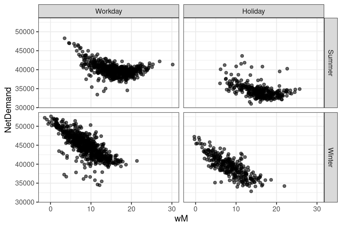
This section illustrated how ggplot2 works, using basic examples. Hopefully it should be clear by now that using ggplot2 requires having created the “right” data.frame before starting the visualization process. Here we used readymade data.frames (mcycle and UKload) and we limited ourselves to adding a couple of variables (Period and DayType). However, the Tidyverse provides some packages (mainly dplyr and tidyr) which make data.frame preparation and transformation easier, relative to base R. Such packages will be described in a later section. Before doing that, we’ll go through a ggplot2 case study, namely the mgcViz package. The reason is that, while this section illustrates how ggplot2 tidily breaks down the visualization process into an layered object-oriented framework of smaller steps and components (e.g., creating the main plot using ggplot, adding layers, dividing the plot into facets and finally rendering it on the screen), you might be wondering: “Why bother?”. Indeed, if you just want to construct a standard scatterplot or histogram, you might be better off using base R (i.e. the graphics package). However, by going through a detailed case study, the next section should convince you that ggplot2 might be preferable to base R for the purpose of constructing a tidy visualization library for a specific class of statistical models.