3. A ggplot2 case study: the mgcViz package
As we said before, ggplot2 provides a powerful framework for building visualization libraries. The best way to see why this is the case, might be to examine a real example. Here we consider the mgcViz package, which provides a layered framework for visualizing Generalized Additive Models (GAMs) using ggplot2. You might have heard about GAMs before but, if you didn’t, don’t worry because background knowledge on GAMs is not necessary to understand this section.
GAMs are an extension of Generalized Linear Models (GLMs), which allow using spline-based smooth effects in addition to the usual linear effects used in GLMs. For example, a Poisson GLM might have the following structure \[ y \sim \text{Pois}\{\mu({\bf x})\}, \;\;\; \log \mu({\bf x}) = \beta_0 + \beta_1 x_1 + \beta_2 x_2, \] where \({\bf x} = \{x_1, x_2\}\) are indipendent variables (covariates) and \(\beta_0, \beta_1, \beta_2\) are regression coefficients. Here we are modelling the log-rate of a Poisson distribution, using linear effects for variables \(x_1\) and \(x_2\). A GAM extension of such a model could be \[ \log \mu({\bf x}) = \beta_0 + f_1(x_1) + f_2(x_2), \] where \(f_1\) and \(f_2\) are non-linear functions, built using spline basis expansions. That is the first effect is \[ f_1(x_1) = \sum_{j=1}^{K_1} \beta^1_j b_j^1(x_1), \] where \(b_1^1(x_1), \dots, b_{K_1}^1(x_1)\) are known basis functions and \(\beta_1^1, \dots, \beta_{K_1}^1\) are unknown regression coefficients (to be estimated). The effect \(f_2\) is defined similarly. There are many classes of effects, for example they can be multidimensional, such as \[ \log \mu({\bf x}) = \beta_0 + f(x_1, x_2), \] where \(f(x_1, x_2)\) is built using 2-D basis functions.
Here we are not interested in discussing how GAMs are estimated, what they can be used for, etc… but we want to demonstrate the advantages of adopting a layer-based system for visualizing GAM models. Consider again the following data sets:
library(qgam)
data(UKload)
head(UKload)
## NetDemand wM wM_s95 Posan Dow Trend NetDemand.48
## 25 38353 6.046364 5.558800 0.001369941 samedi 1293879600 38353
## 73 41192 2.803969 3.230582 0.004109824 dimanche 1293966000 38353
## 121 43442 2.097259 1.858198 0.006849706 lundi 1294052400 41192
## 169 50736 3.444187 2.310408 0.009589588 mardi 1294138800 43442
## 217 50438 5.958674 4.724961 0.012329471 mercredi 1294225200 50736
## 265 50064 4.124248 4.589470 0.015069353 jeudi 1294311600 50438
## Holy Year Date
## 25 1 2011 2011-01-01 12:00:00
## 73 0 2011 2011-01-02 12:00:00
## 121 0 2011 2011-01-03 12:00:00
## 169 0 2011 2011-01-04 12:00:00
## 217 0 2011 2011-01-05 12:00:00
## 265 0 2011 2011-01-06 12:00:00See ?UKload for more information about the data. A simple GAM model for aggregate electricity demand \(\text{Dem}_t\) could be:
\[
\mathbb{E}(\text{Dem}_t) \sim \psi_{D_t} + f_1(T_t) + f_2(T^s_t) + f_3(S_t) + f_4(L_{t-48}) + f_5(t),
\]
where we have smooth effects for the hourly temperatures (\(T_t\)), the smoothed temperature (\(T^s_t\), defined by \(T_{t}^s = \alpha T_{t-1}^s + (1-\alpha)T_t\) with \(\alpha = 0.95\)), the variable indicating the position within the year (\(S_t\)), the sequential index representing time (\(t\)) and the observed load at the same time of the previous day (\(L_{t-48}\)). \(\psi_{D_t}\) is a parametric effect, whose value depends on \(D_t\), which is a factor variable indicating the day of the week. This model can be fitted using mgcv as follows:
fitG <- gam(NetDemand ~ Dow + s(wM) + s(wM_s95) + s(Posan) +
                        s(NetDemand.48) + s(Trend, k = 6), data = UKload)
Let’s say that we now want to visualize the seasonal effect, that is the effect of \(S_t\) (Posan in the code). This is done as follows:
plot(fitG, select = 3, scale = FALSE) where the
 select argument is used to determine which smooth effect should be plotted. Given that plot is a generic function and that:
class(fitG)## [1] "gam" "glm" "lm"the above code is calling plot.gam from the mgcv package. plot.gam is based on base R plotting functions, not on ggplot2. This function does its job, but has some limitations that can be addressed by adopting a layer-based plotting framework. The first issue is that plot.gam has quite a lot of arguments:
args(plot.gam)## function (x, residuals = FALSE, rug = NULL, se = TRUE, pages = 0,
## select = NULL, scale = -1, n = 100, n2 = 40, n3 = 3, theta = 30,
## phi = 30, jit = FALSE, xlab = NULL, ylab = NULL, main = NULL,
## ylim = NULL, xlim = NULL, too.far = 0.1, all.terms = FALSE,
## shade = FALSE, shade.col = "gray80", shift = 0, trans = I,
## seWithMean = FALSE, unconditional = FALSE, by.resids = FALSE,
## scheme = 0, ...)
## NULLFurthermore, many of its arguments are not used at all during most function calls, for instance
plot(fitG, select = 3, scale = FALSE, n2 = 100, theta = 10, n3 = 4)produces exactly the same plot as before (not shown), because the arguments n2, theta and n3 are not relevant for one-dimensional effects plots. A related problem is that it is not possible to control the graphical options of the layers appearing in the plot. For example:
plot(fitG, select = 3, scale = FALSE, col = "red")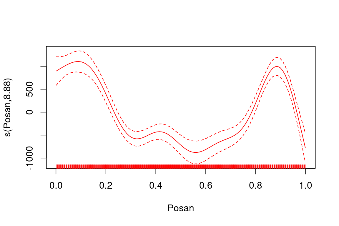
makes the whole plot red, because the col = "red" argument is passed, via the ... argument (a.k.a. ellipsis), to each plotting function called within plot.gam (e.g. rug). So it is hard to customize the appearance of the plot. The fact that the graphical elements of the plot are rendered in a fixed order by plot.gam is also limiting, for example:
par(mfrow = c(1, 2))
plot(fitG, select = 3, scale = FALSE, residuals = TRUE, ylim = c(-2000, 2000))
plot(fitG, select = 3, scale = FALSE, residuals = TRUE, pch = 1, ylim = c(-2000, 2000))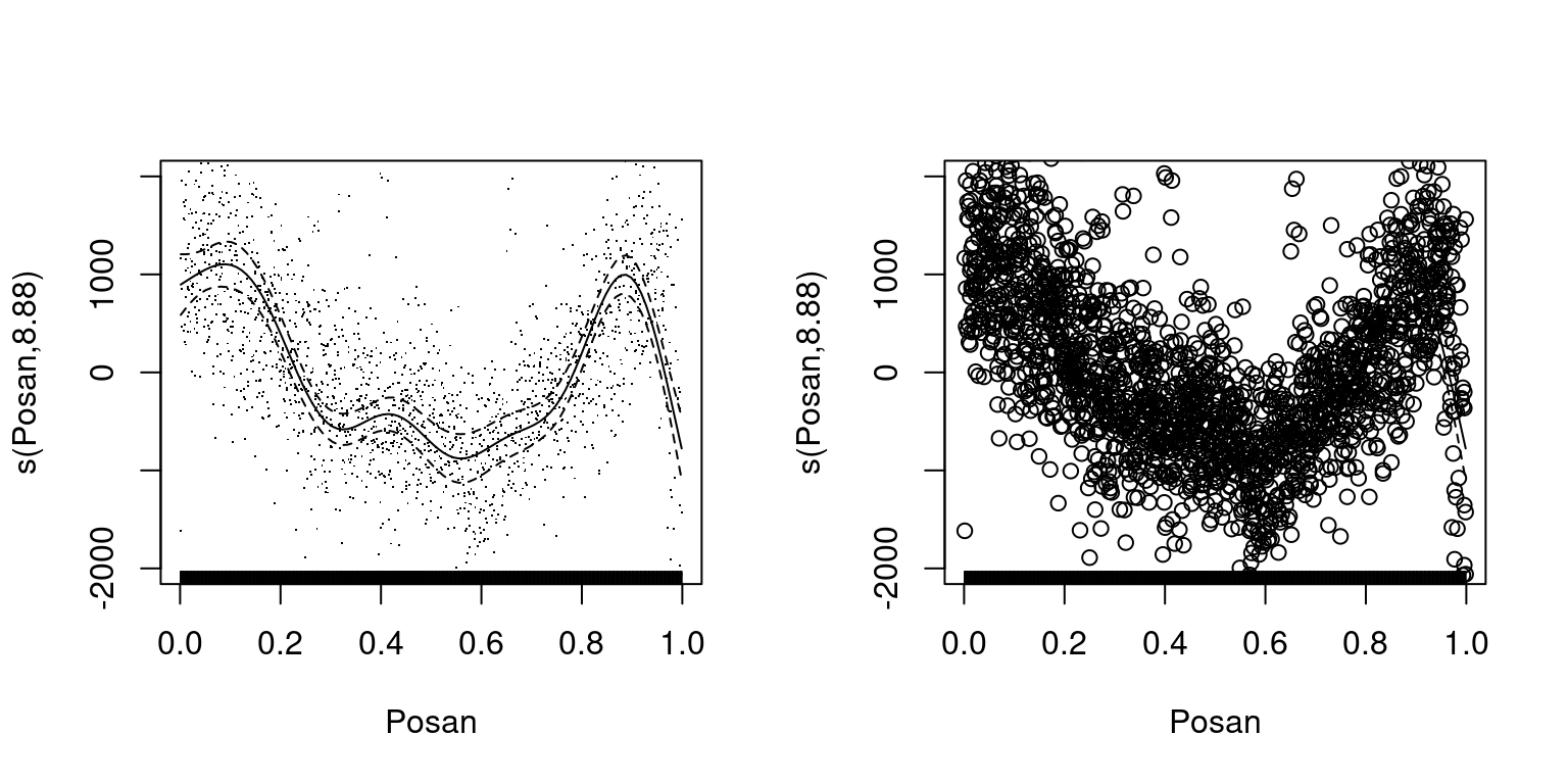
Here the points representing the residuals are always plotted over the fitted effect and confidence intervals so, if you change the size of the points, they will completely hide the fit, as on the plot on the right. We could probably live with the limitations mentioned so far, but a more important issue is that it is quite hard to add new features to the plots offered by plot.gam. In fact, plot.gam is a big multi-purpose function, and adding a new graphical features requires looking at its source code, understanding what is going on, and modifing the whole function (e.g. we need to add new arguments, choose at which point within plot.gam the new graphical layer should be rendered, etc). So adding new features is a rather involved process.
The good news is that the limitations just mentioned make plot.gam a very good case study for illustrating the usefulness of layer-based framework provided by ggplot2. In particular, let’s see how the mgcViz package solves these issues by adopting the layered system based on ggplot2. To use it, we need to convert the output of gam to an object of class gamViz:
library(mgcViz)
fitG_v <- getViz(fitG)

class(fitG)
## [1] "gam" "glm" "lm"class(fitG_v)## [1] "gamViz" "gam" "glm" "lm"so we see that the output of getViz is still of class gam. For the purpose of illustration, here we show how to plot an effect step by step, but in practice there are shortcuts (see ?plot.gamViz). We start by extracting individual effects using the sm function:
e3 <- sm(fitG_v, 3)
class(e3)
## [1] "tprs.smooth" "mgcv.smooth.1D"So e3 is a one-dimensional effect built using a thin plate regression splines basis (tprs), which we can plot using a class-specific method:
pl3 <- plot(e3) # calls plot.mgcv.smooth.1D()
class(pl3)
## [1] "plotSmooth" "gg"Having stored the plot in pl3, an object of class plotSmooth which inherits from gg, we can then add layers and render
pl3 <- pl3 + l_fitLine() + l_ciLine()
pl3 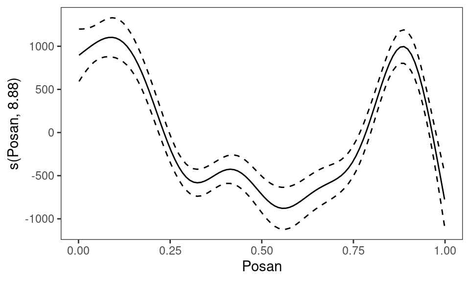
where the last line calls print.plotSmooth. In one step:
plot(sm(fitG_v, 3)) + l_fitLine() + l_ciLine() # not shownHow does this work? The functions starting with l_ are layers implemented in mgcViz and can be seen as wrappers around one or more ggplot2 layers (e.g. mgcViz::l_fitLine is a wrapper around ggplot2::geom_line). All mgcViz layers start with the l_ prefix.
Why is this useful? Because, as we illustrate below:
- we now have full control over which graphical arguments are passed to each layer;
- we can add the layers in the order we like;
- adding new layers does not require modifying the function that created the initial plot (here
plot.mgcv.smooth.1D) - the number of arguments of the initial plotting function is greatly reduced, in fact
args( plot.mgcv.smooth.1D )## function (x, n = 100, xlim = NULL, maxpo = 10000, trans = identity,
## unconditional = FALSE, seWithMean = FALSE, nsim = 0, ...)
## NULLThere is a variety of layers available, for example:
pl3a <- plot(sm(fitG_v, 3)) + l_ciPoly(level = 0.99) + l_fitLine(color = "red") + l_rug()
pl3b <- plot(sm(fitG_v, 3), nsim = 20) + l_simLine()

gridPrint(pl3a, pl3b, ncol = 2)
where the second plot shows a set of 20 random curves drawn from (a Gaussian approximation to) the posterior distribution of the seasonal effect (but this is not crucial here). As for most smooth effect plots in mgcViz, the output of plot.mgcv.smooth.1D has class plotSmooth, which contains an object of class c("gg", "ggObj") is its $ggObj slot. Here gridPrint simply extracts the ggplot objects from pl3a$ggObj and pl3b$ggObj, and renders them on one page. To get the full list of available mgcViz layers for a particular object, do:
listLayers( plot(sm(fitG_v, 3)) )## [1] "l_ciLine" "l_ciPoly" "l_dens2D" "l_fitDens" "l_fitLine" "l_points"
## [7] "l_rug" "l_simLine"We can of course use layers and functions provided by ggplot2, for example:
pl <- plot(sm(fitG_v, 3))
pl + geom_hex(data = pl$data$res, alpha = 0.7) + l_fitLine() +
     l_ciLine() + xlim(c(0.25, 0.75))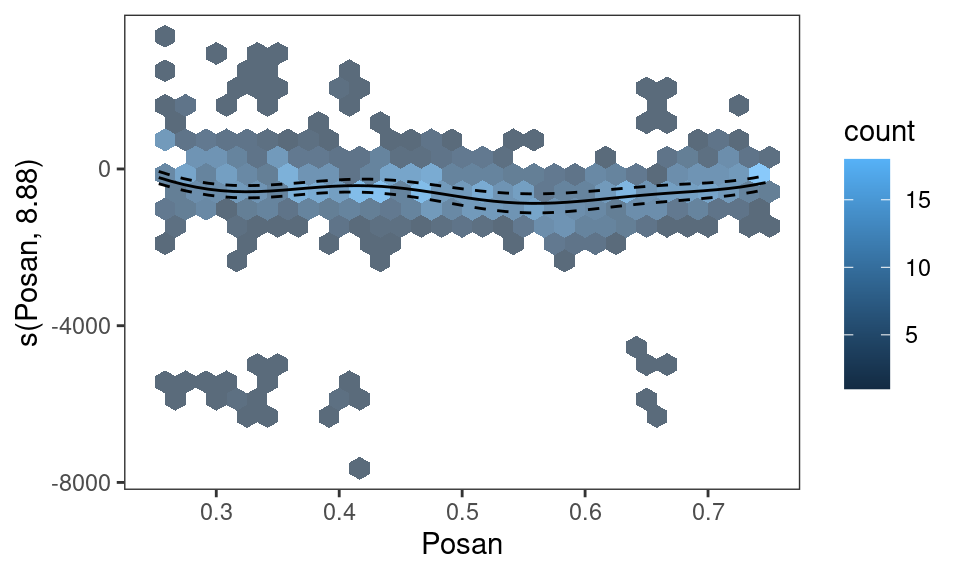
Here we used ggplot2::geom_hex to plot the density of the residuals, which required specifying that the residual data can be found in pl$data$res, and we zoomed along the \(x\)-axis on \([0.25, 0.75]\) using ggplot2::xlim.
The examples above should illustrate some of the advantages of a layered system. To get some insights into how this layered system might be useful to someone trying to build a graphical library for GAM models (but this applies to other models, of course), it’s probably instructive to have a look at how ggplot2 layers can be wrapped up to extend the array of layers made available by mgcViz. Here we consider implementing an mgcViz layer which plots the residual density using binning, as in the last plot above. Suppose that we want to call such layer l_binRes. The first thing we need to do, is to build its general (or generic-like) version:
l_binRes <- function(...){
  arg <- list(...)
  o <- structure(list("fun" = "myBinRes",
                      "arg" = arg),
                 class = "gamLayer")
  return(o)
}
This is the template used by all mgcViz layers. The layer returns an object of class gamLayer, where the arg slot contains all arguments that will be passed to the type-specific layer (you’ll see what we mean by type-specific in a minute). The fun slot indicates the name of the internal function to be used. This is:
myBinRes.1D <- function(a){

  a$data <- a$data$res
  a$mapping <- aes(x = x, y = y)
  out <- do.call("geom_hex", a)
  return( out )

}
As you can see, this function returns the output of the ggplot2::geom_hex layer. The .1D suffix in myBinRes.1D is there because it matches the type of the plot we are focussing on:
pl$type## [1] "1D"Having set up the general l_binRes function and the internal function myBinRes.1D, we can now do:
pl + l_binRes(alpha = 0.7) + l_fitLine() + l_ciLine()
which works! We could say that this is an informal object oriented framework, because we are dispatching the method (myBinRes.1D) based on the type slot, rather than on a formal class. If we wanted to use the new layer on an plot of a different type, we would need to develop a specific myBinRes function for that plot type. For instance, if we extract the day-of-week effect and build its plot:
pl <- plot(pterm(fitG_v, 1))this would not work:
pl + l_binRes(alpha = 0.9) + l_fitPoints(col = 2) + l_ciBar(col = 2)## Warning in value[[3L]](cond): No myBinRes() layer available for type "Pterm
## Factor"To make binRes work with plots of type c("Pterm", "Factor"), we need to define:
myBinRes.PtermFactor <- function(a){

  a$data <- a$data$res
  a$mapping <- aes(x = x, y = y, z = y)
  a$fun <- function(x) length(x)
  out <- do.call("stat_summary_2d", a)
  return( out )

}
where we used the stat_summary_2d layers from ggplot2, which is more appropriate when the \(x\)-axis is categorical. Now we get:
pl + l_binRes(alpha = 0.7) + l_fitPoints(col = 2) + l_ciBar() The point of all this is illustrating that, using the layer-based system provided by
 ggplot, it is easy to introduce new GAM-specific layers for mgcViz, without modifying the functions used to build the initial plots (here plot.mgcv.smooth.1D and plot.ptermFactor). Of course, the new layer introduced here (l_binRes) is quite trivial, and we might be better off using the raw ggplot2 layers directly (e.g. stat_summary_2d), but some of the layers implemented by mgcViz are quite complicated, hence coding them in mgcViz is worthwhile (see, e.g., the code for mgcViz:::l_fitDens.1D).